We live in a world that moves fast. Where productivity is praised, time feels scarce, and slowness is often mistaken for inefficiency. Days blur. Screens glow. We rush through tasks, through places, through each other. The Timekeeper was born from a desire to interrupt that rhythm.
This project reimagines the library not just as a place of knowledge, but as a sanctuary for presence. It uses architecture as a tool to slow the body, engage the senses, and create moments that stretch time rather than compress it.
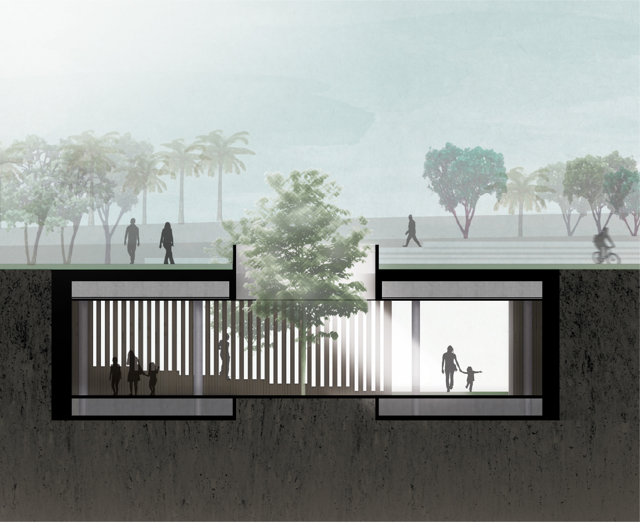
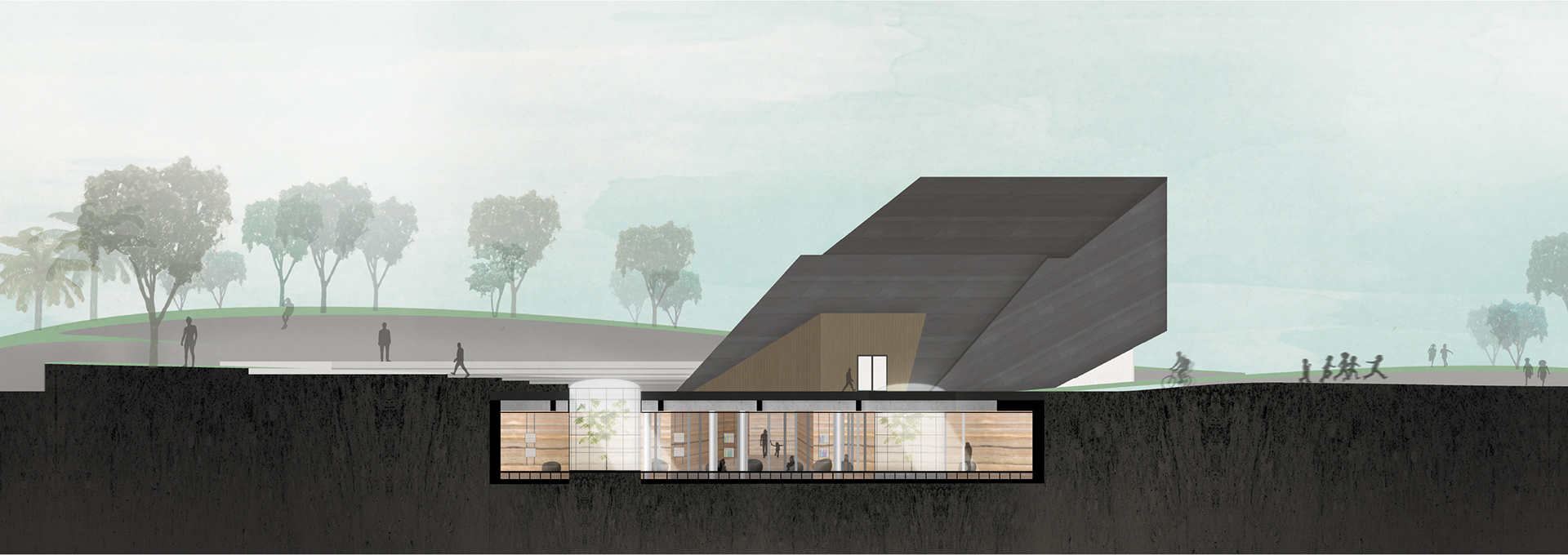
Set in Yarmouk, Kuwait’s first accredited health city, the project plays with spatial and sensory contrast. Above ground, the architecture is bold and sculptural, designed to capture attention and draw people in through landscape gestures and soft boundaries. But as visitors descend below, the tone shifts. Materials like rammed earth and felted stone absorb sound. Light filters gently through courtyards. Circulation slows into a meander.
This shifting rhythm between exposure and retreat, movement and stillness, creates a layered experience that encourages learning, reflection, and pause.
The Timekeeper is a response to the overwhelming pace of life. It is a quiet intervention in a world that sometimes feels too loud. A space that invites you to stay a little longer.
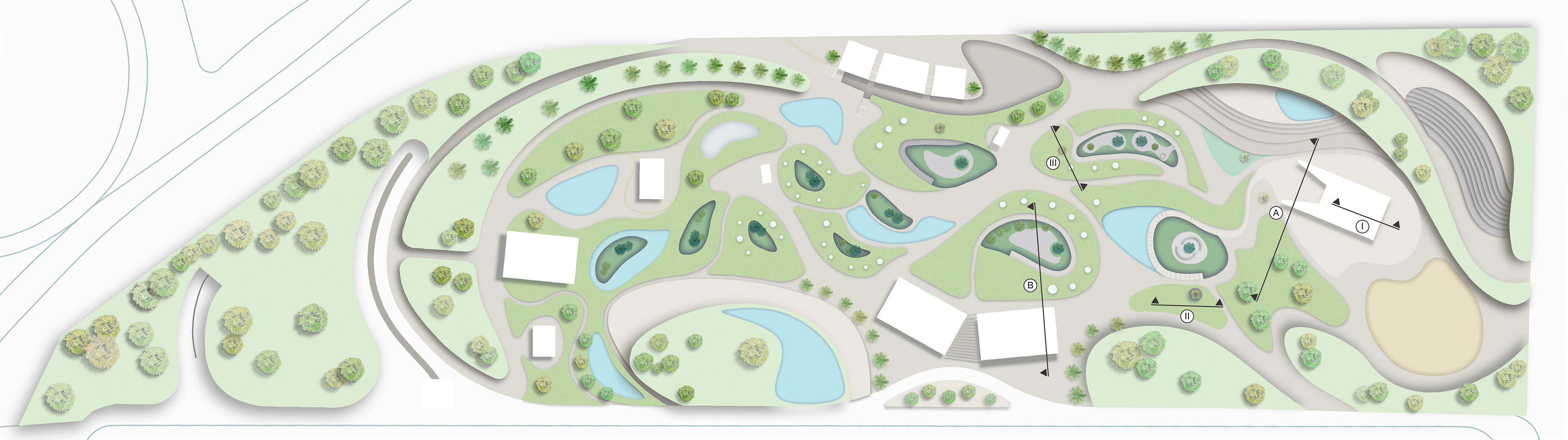
The landscape plan is shaped by a language of softness—organic curves, gentle slopes, and flowing transitions that encourage wandering over rushing. Each entry point was placed with intention, responding to the rhythms of the city around it. A path from the nearby cultural center draws artists and adult visitors into creative, reflective spaces. Another extends from a local elementary school, welcoming children into play areas and open courtyards. A third entrance, aligned with the pedestrian exercise route, offers a shaded green break for joggers and walkers, complete with cafés and rest spots.
The network of paths doesn’t just connect, it guides. Winding routes lead toward sunken courtyards, some with ramps that quietly bring you underground, others designed to be viewed from above. Skylights are scattered across the site, offering passing glimpses into the world below. The landscape isn’t structured for efficiency. It’s built for curiosity. For slowing down. It is for letting people find their way, at their own pace.
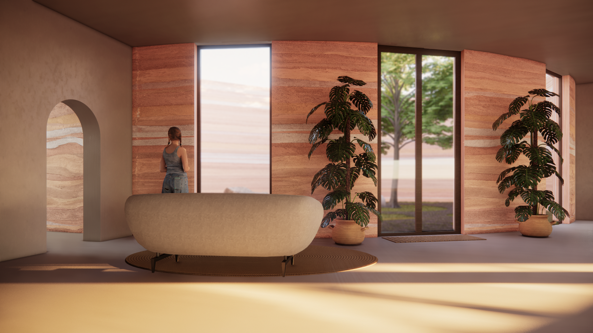
A shared corridor frames the courtyard view, where warm rammed earth walls and soft light ease the pace between library rooms.
A sunken courtyard offers fresh air, soft greenery, and a quiet view back into the library. A moment of nature carved for meditative reflection.
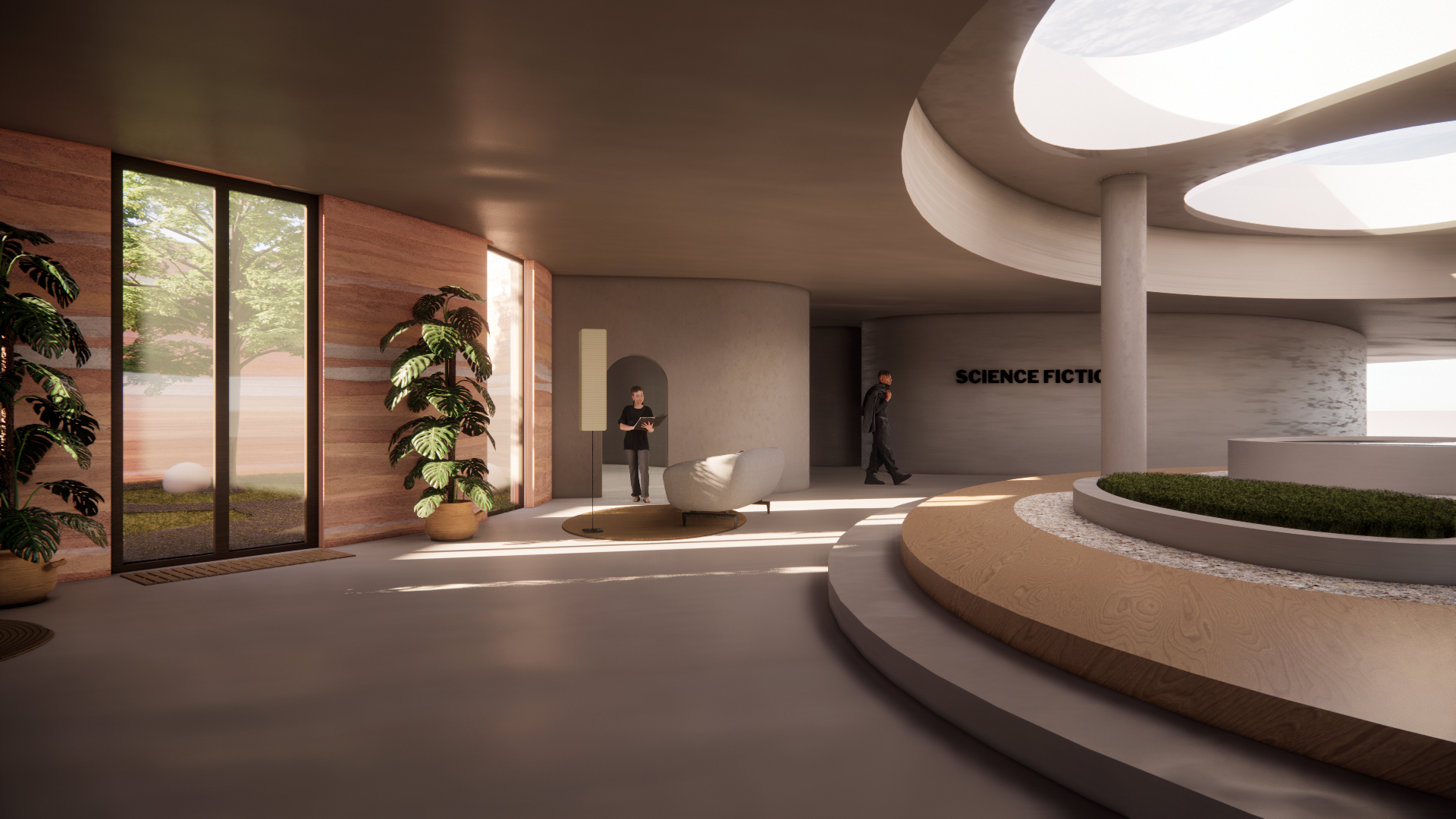
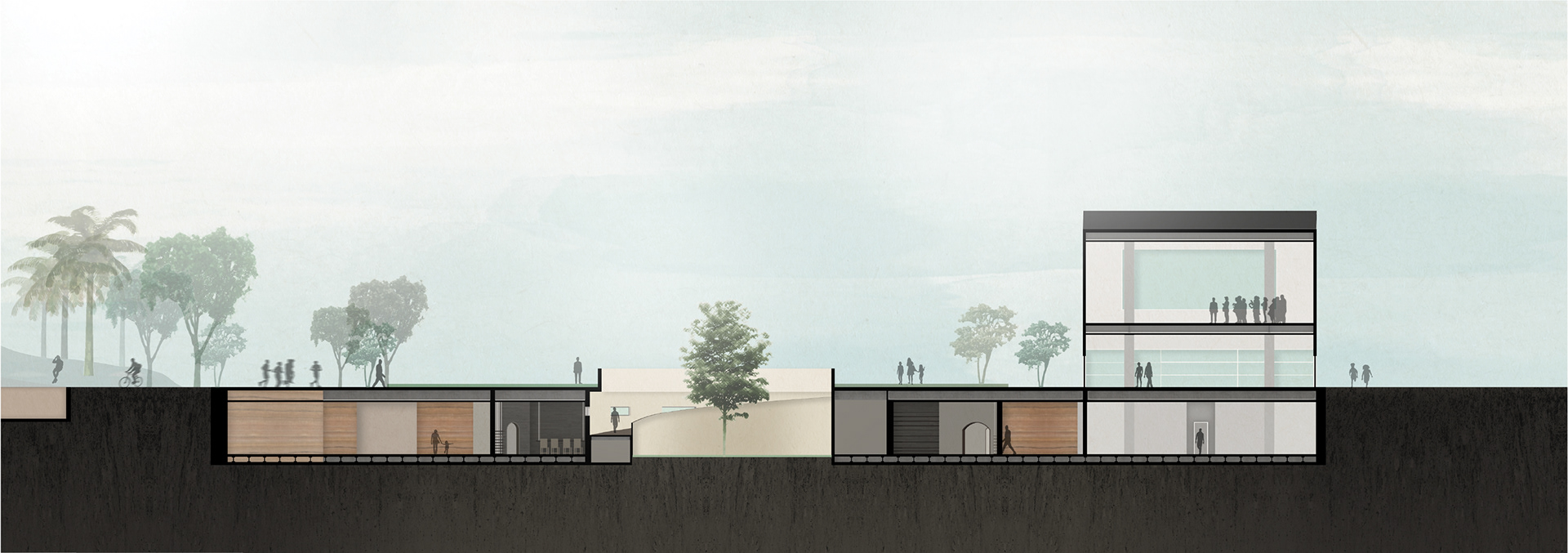
Instead of one central hall, the library is broken into pockets. Each room has its own theme, each corner a discovery. The layout encourages wandering, letting visitors stumble into stories and spaces at their own pace.
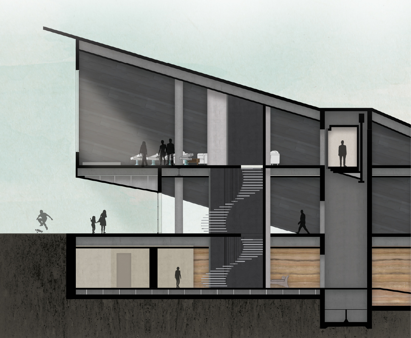
Moment Section I
Moment Section II
Moment Section III
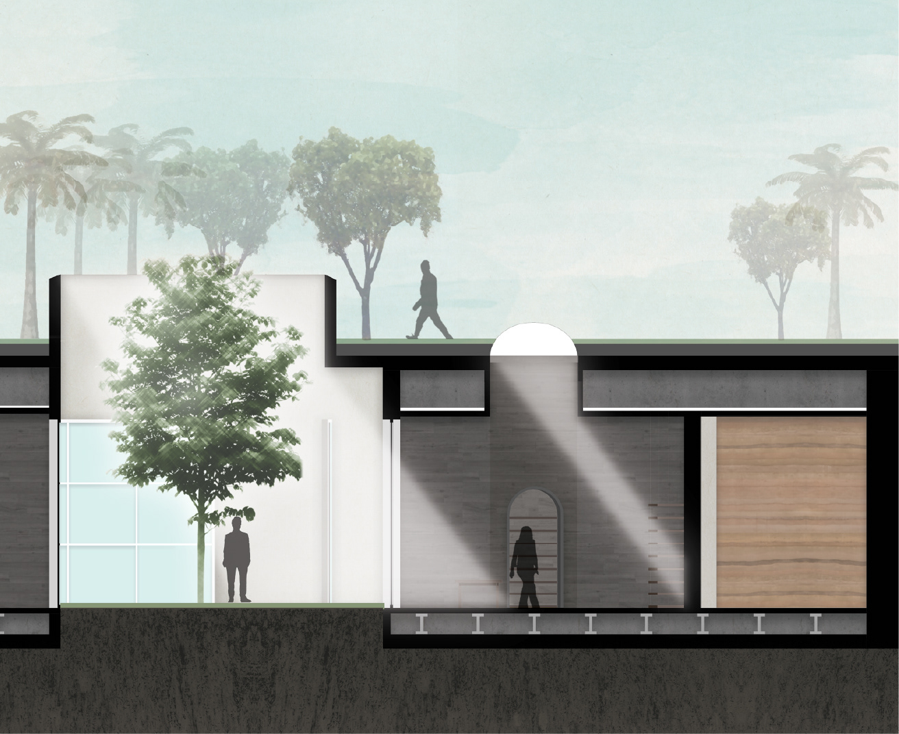
These sectional studies reveal how light, mass, and privacy shift across levels. Above ground is bold, sculptural, and inviting. Below, spaces retreat inward, wrapped in thicker walls and softened light, quiet moments designed to be slow.
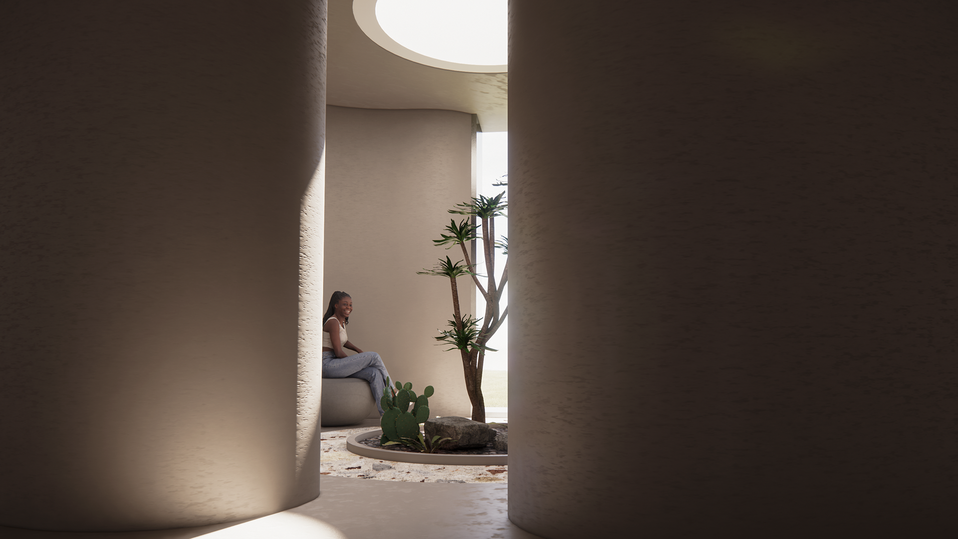
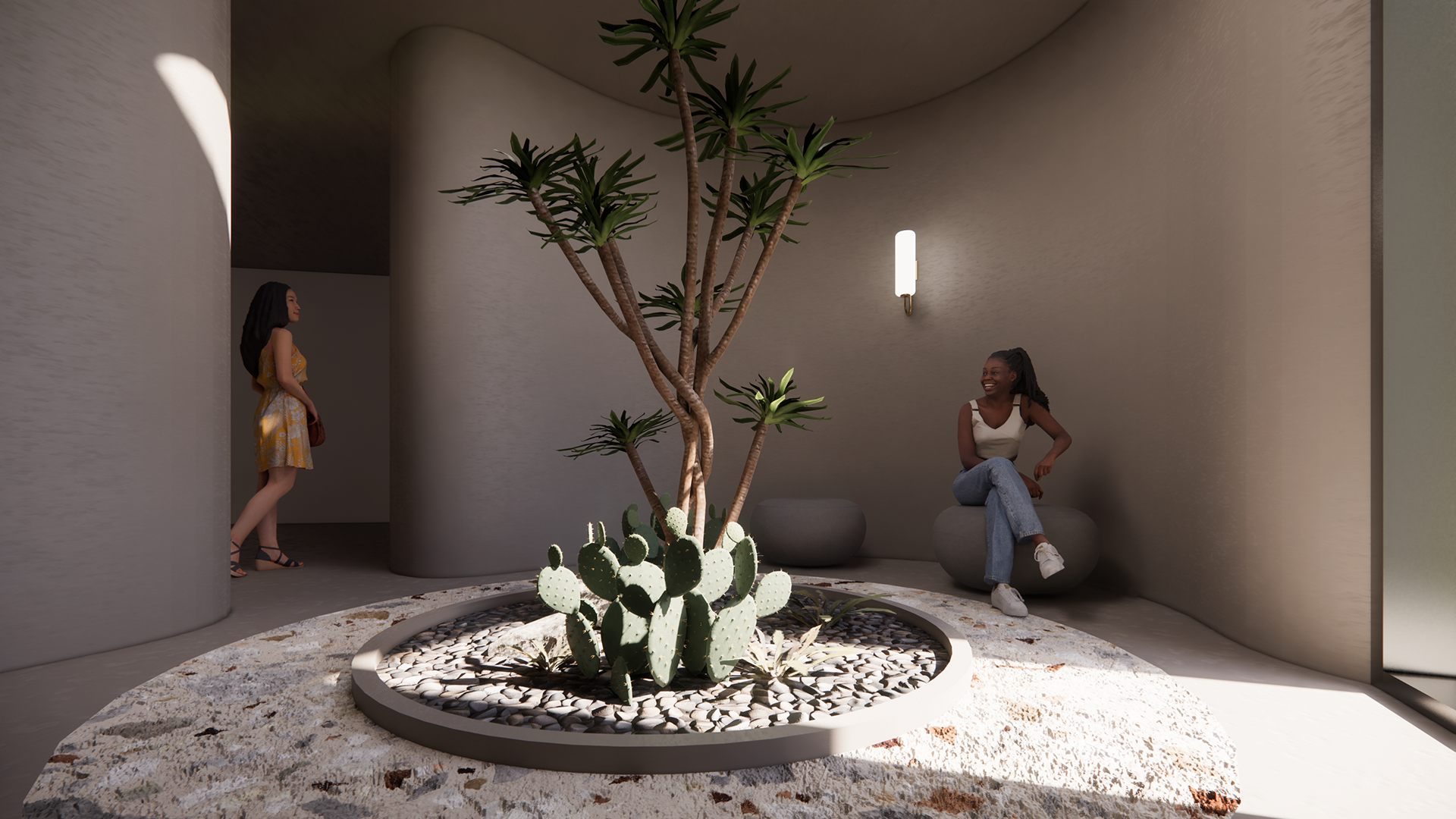
A private nook nestled underground. Curved walls lead inward, where natural light slips in from above, softened by plants and stone—a quiet sanctuary, designed for reprieve.
The entrance nearest to the school leads into a sloped ramp that descends into one of the largest underground spaces. Filled with beanbags and light-filled indoor gardens, it’s a communal zone where workshops, reading nooks, and a small cinema branch out—designed especially for younger visitors to learn, rest, and roam.
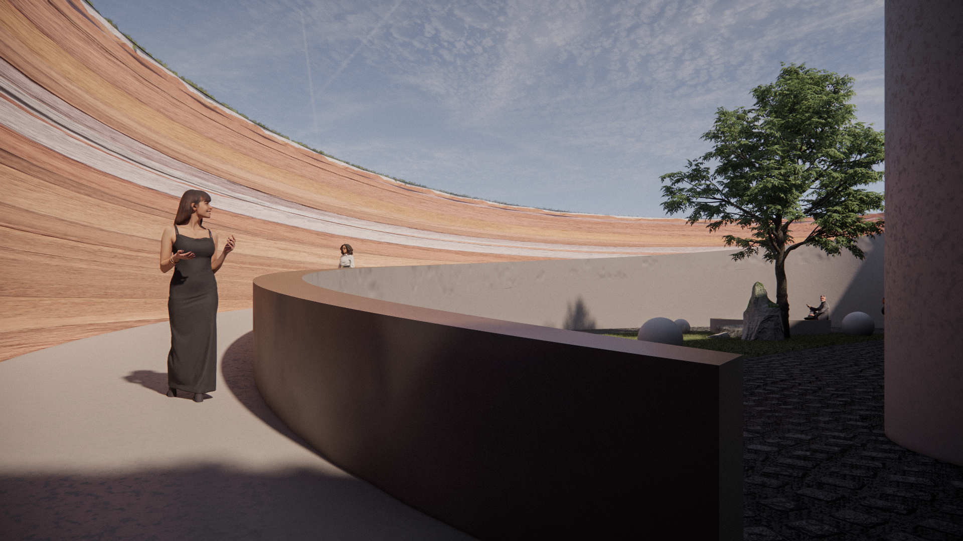
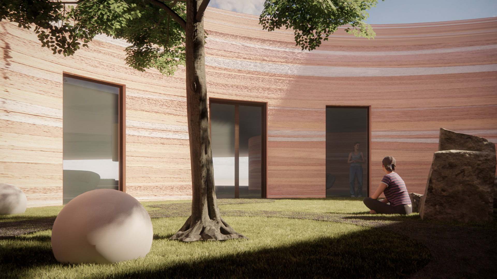
A part of the landscape’s curved paths slopes gently downward, guiding visitors toward a sunken courtyard. Enclosed by rammed earth walls and softened by trees, it marks a quiet shift in atmosphere, a slow, intentional descent into the spaces below.
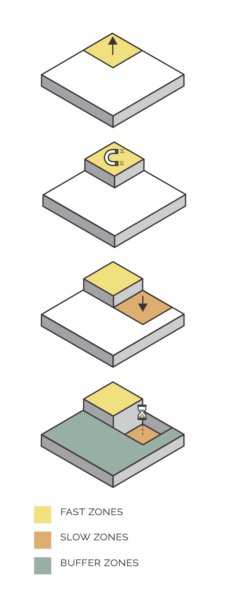
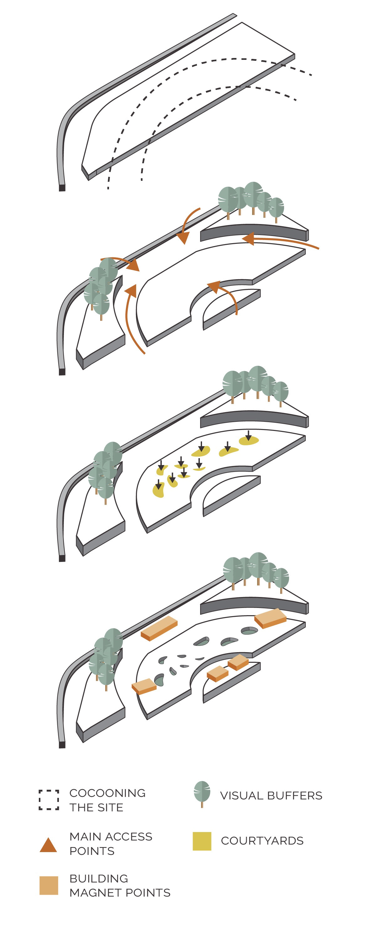
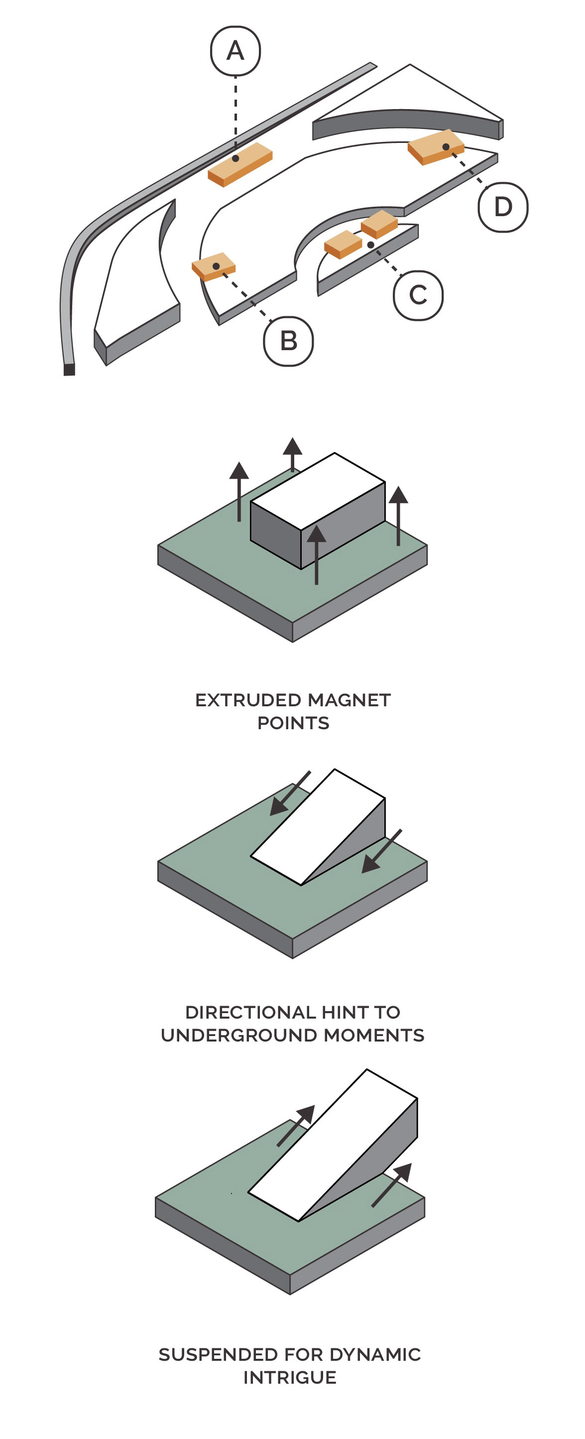
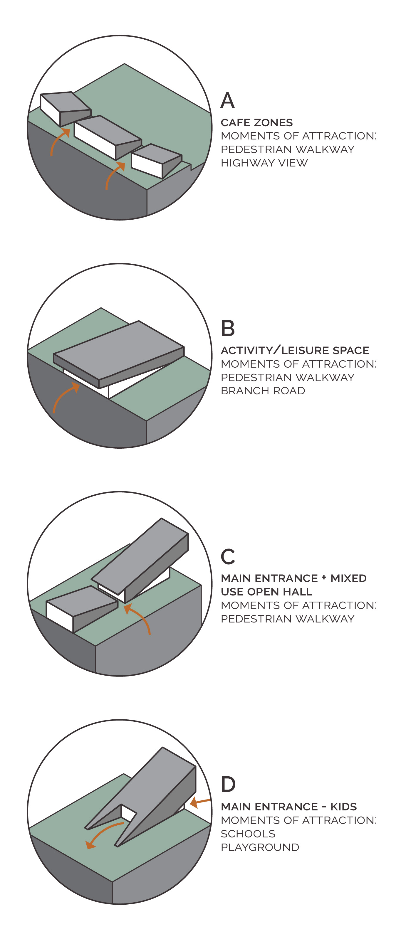
A series of diagrams exploring the project’s spatial language, where fast zones give way to slow, courtyards act as visual anchors, and buildings above ground rise as magnet points. Each entrance, path, and buffer is designed to guide rather than direct, drawing people into intrigue, rest, and moments of discovery.
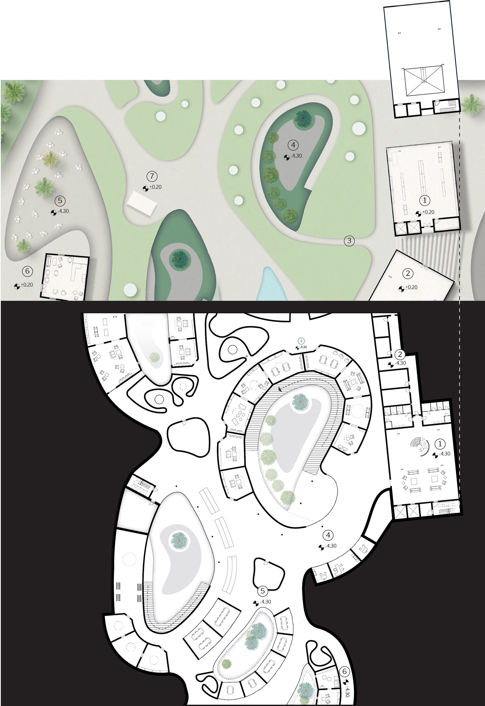
This multi-level plan highlights the contrast between the angular, rigid geometry of the buildings above and the organic fluidity of the underground. The landscape sits between them as a quiet transition, guiding movement toward courtyards and entry points. Below, soft curves meander around sunken courtyards, where the library is broken into smaller pockets. Scattered skylights offer quiet glimpses into the world beneath, inviting curiosity and gradual descent.
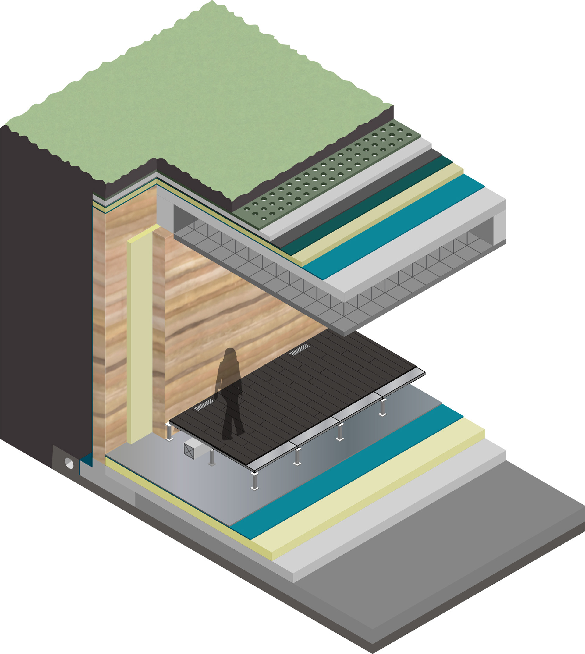
An exploded axonometric showing the structural and material layers, from rammed earth walls to planted rooftops. Each element is designed to support thermal comfort and spatial clarity throughout the project.
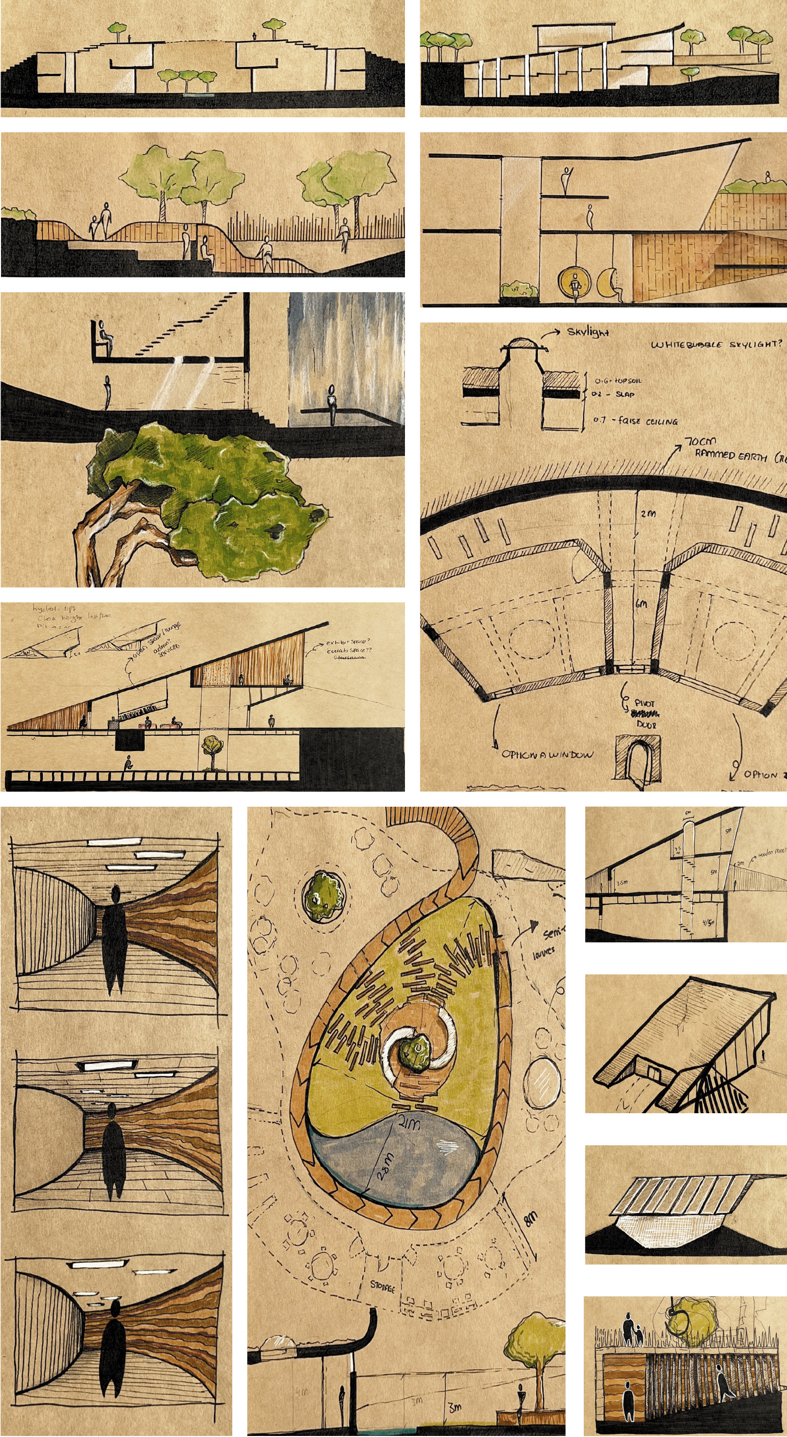
These initial sketches were a way for me to explore spatial language—how contrast shapes experience across form, movement, and material. I was drawn to the tension between angular architecture and more fluid, meandering paths, and how that dialogue could guide both layout and atmosphere. Elements like trees, courtyards, and textured materials began to define a slower rhythm, grounding the project in light, texture, and pace.